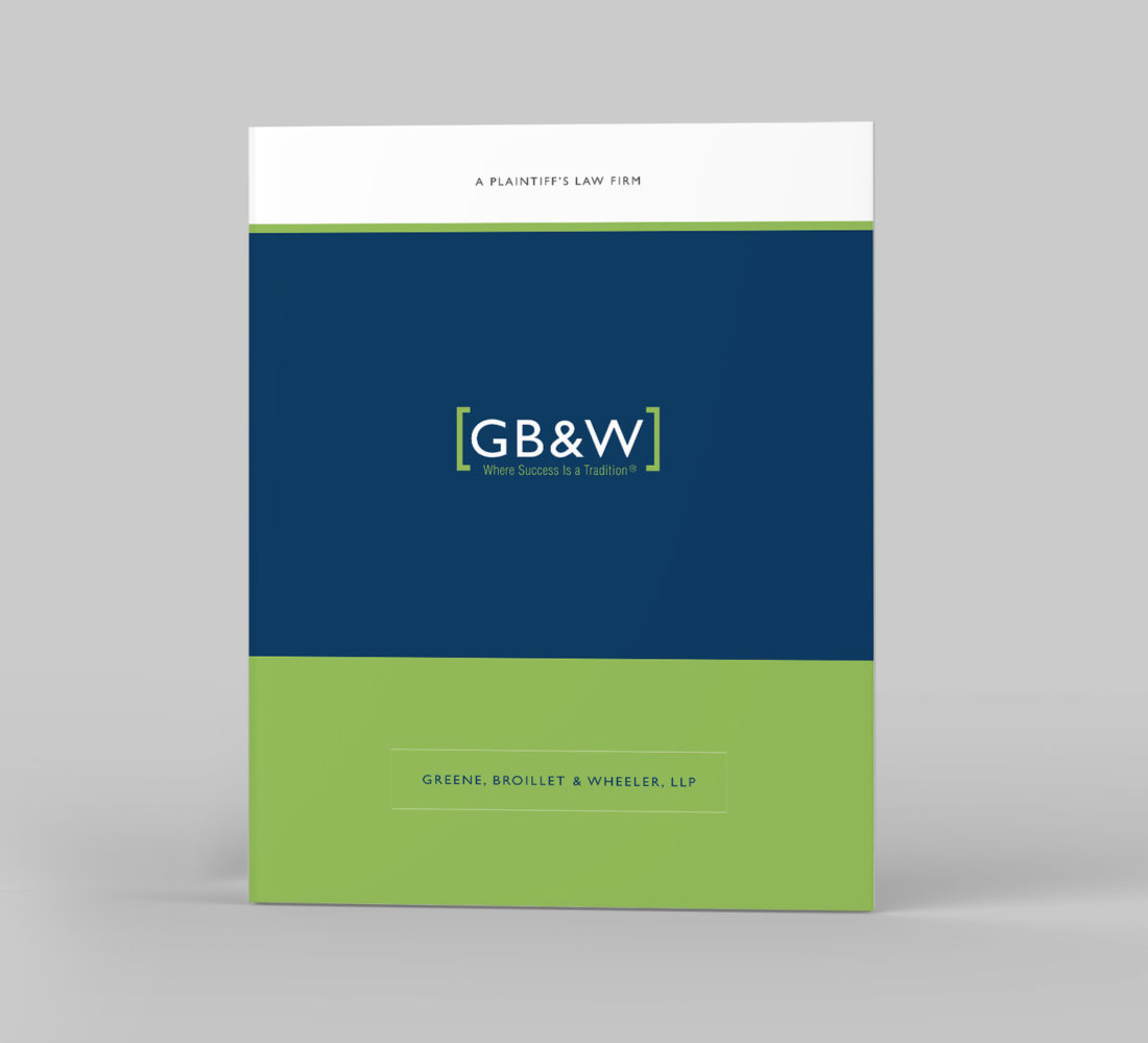
Russakow, Greene & Tan

Not wanting to blend in with other law firms, this group of attorneys were looking towards a professional, yet modern style for their firm’s identity. The result was fresh take on a monogrammed logo and an unexpected approach to their print advertising.

Taylor & Ring

Brand redesign for Los Angeles-based personal injury trial lawyers. Much like Aristotle’s concept “the whole is greater than the sum of its parts”, this firm’s strength lies in the collective talents of the two founding partners. We achieved this visually by combining parts of each

Hollywood Park

Preliminary brand development for the new Hollywood Park site, exploring how the diverse community of Los Angeles comes together. This destination-based book shows how these cultures mix together through food, music, art, shopping and shared experiences. (Creative developed for PS&M Communication Arts.)

Various Logos

A logo is the visual representation of your company, telling the story of your brand in the simplest visual terms. It should be memorable, unique, relevant and appropriate. An effective logo sets a good first impression, connects with your customers and helps separate you from

Legacy Brewing Co.

Unhappy with the creative developed by another design firm, this craft beer maker was seeking an identity that better aligned with their company’s vision and attributes steeped in American tradition. The solution was a logo that embodies freedom, legacy and country by incorporating strong iconography

Greene Broillet & Wheeler

The Santa Monica-based law firm was looking to develop new marketing materials while retaining the equity they’ve established with their logo and color palette. Above are a few examples of how we helped extend the brand to collateral materials, print advertising and a quarterly eNewsletter.

PHFE

Brand evolution for a non-profit that supports and sponsors other health organizations with fiscal management and counseling programs. Looking to connect with their audience on an emotional level, a more organic logo identity and website were developed, incorporating a fresh color palette and rich photography.

Low Man on the Totem Pole

Logo and cover design for a book providing insights and strategies to help the employee in all of us realize their full potential. The symbolism of the totem pole works on two levels: it resonates with the viewer who may feel they’re undervalued at the

0

Michelle Mohlere

As a real estate agent that helps homeowners in need of design and color direction when preparing their homes for sale, Michelle wanted a logo identity that would promote both her practical approach with her creative expertise. By juxtaposing ornate and sans-serif letterforms, we arrived

The Executive Advisory

Spend a few minutes in a meeting with this group of business coaching consultants and you’ll find their strength is in collection of their core team members. The brand strategy was to infuse the unique qualities of each stakeholder throughout their brand materials using point-of-view